Merri Health: branding
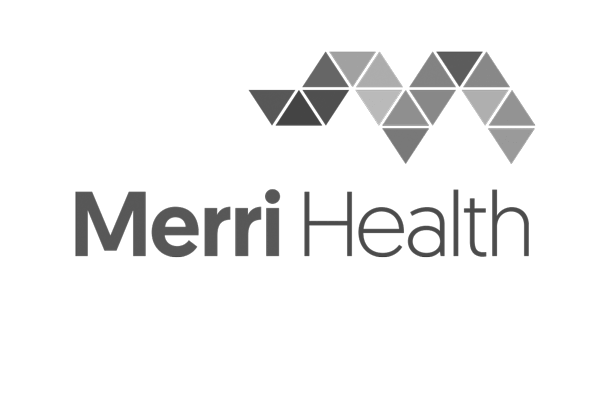
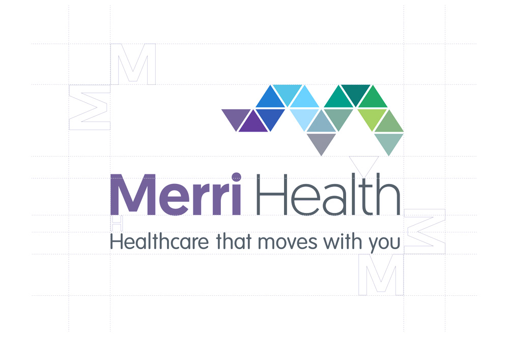
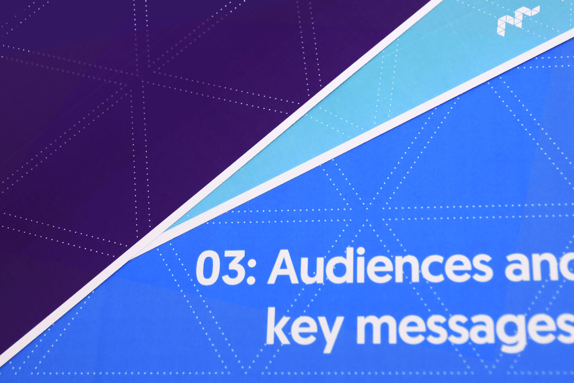
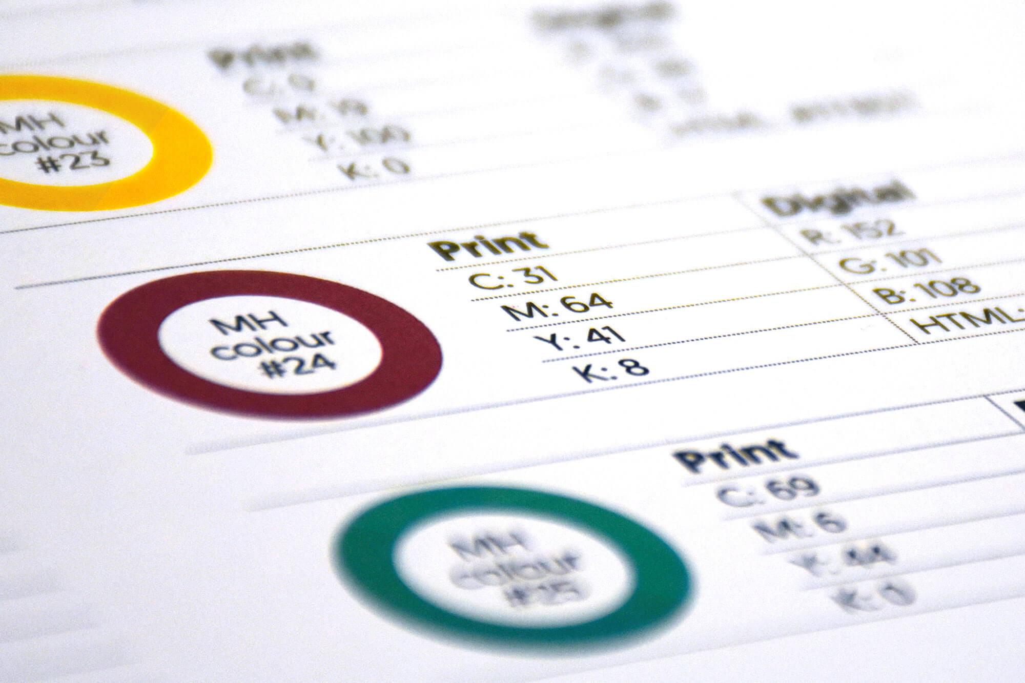
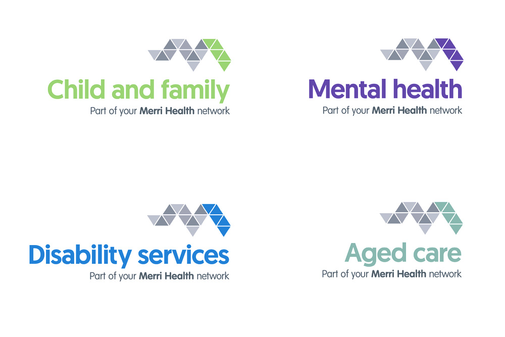
When Merri Community Health Services became Merri Health, we helped the organisation make a smooth and successful transition to its new identity. The many ‘triangles’ in the logo were a reflection of the many health services on offer, while the ‘M’ shape provided a subtle visual link back to the organisation’s former logo. Disruptive Media also developed the strapline, key messages, visual language and style guide for the new brand.
Visit: merrihealth.org.au